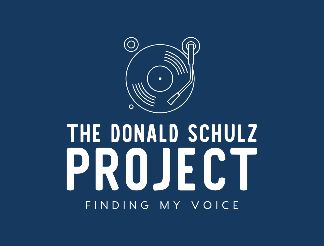
I am thinking about using a new logo. It may be in addition to the old logo as they both have a similarity to them that I will explain. Both of these logos represent a record player with the needle on the record. You may not have realized that the original logo was a record player as it was very abstract. The cyan circle is the record and the yellow triangle is the head of the needle and it is playing the record. The original design was crafted by Helen Wong back in probably in the early 80’s.
The logo was originally crafted for a company I was trying to get off the ground. Things were just starting to move into the digital world of CD’s. I was actually trying to put together a CD plant about 20 kilometers north of Barrhead in an even smaller village called Fort Assiniboine. Some things to know about Fort Assiniboine is that this was the oldest settlement in Alberta and it came very close to being named the capital because of that history. I would imagine it was much bigger than it is currently but this was the stop of the fur traders that would come up the Assiniboine river and then travel north into the Territories.
One thing you needed for a CD plant was access to clean water, anyway I never got to complete that whole plan but one thing I did want to call it was DISC Records. So the original logo had DISC written in those block letters where DONALD now exists and in that written style of script was the word Records. I also used a version of this logo that started when I was at McEwan University studying “Micro Computers” I did a mock up of this logo using DL’S in the block letters and Technology is the written script part of the logo. I used this for a bunch of papers and reports that were part of my homework as we did mock proposals and presentations. After college I continued to use this logo as I continued to work as a consultant in Technology. I could not get hired as an employee by anyone in Edmonton, but I had lots of work, it kept coming and I kept doing the work under DL’s Technology.
Now the reason I am thinking about adding this new logo to the mix is partially because of merchandising reasons. I am not sure how I feel about people walking around with my name plastered on a hat or a T-Shirt, but as I start using this new logo I could take just the record player part and put that on a piece of clothing and I would be okay with that. If I see you on the street and I see that logo on your head I will know that you are familiar with my work. The other reason is that the old logo does not really say “The Donald Schulz Project” which would take the focus away a little from just my name, just seems weird. However, I don’t see how the old design could deal with adding The and Project to the logo. Don’t see how I could do it and it still look professional.
Let me know what you think in the comments below. I have turned on the comments for this post so you can provide me with some feedback. I do appreciate everyone that is listening to my music, some of it is okay and I hope I am getting better. I have a lot more ideas that I will be exploring and I am glad you are on this ride with me.